 Science fiction is at its best when it can accurately predict the shape of things to come, or even more so – when it can actually influence the shape of the future. Did you know that automatic doors were inspired by Star Trek for instance? Right down to the sound effect?
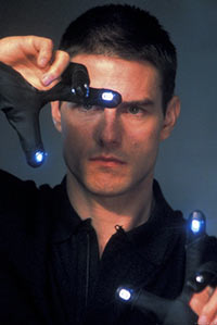
One of the very best examples of such science fiction in recent designs of course is the interface from Minority Report: an interface that relied on a range of gestures and swipes in order to arrange information in the same way that you would conduct an orchestra. The gestures were intuitive and fast, but at the same time allowed for a lot of complex data to be displayed on the screen.
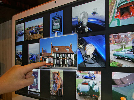
And of course shortly after, Apple released iOS which relied on a number of similar gestures albeit on a touch screen rather than in mid-air. By swiping, pinching and twisting users could move images around the screen, navigate forward through information and shrink and enlarge information they wanted to see in more or less detail. Web designers had to take note as quickly touch became the focus and users began to expect a much more intuitive set of commands compared to what had previously been the prevailing paradigm.
Amazingly this because the prevailing form of man-machine interaction across the majority of devices, making that one pivotal scene in Minority Report truly prophetic and instrumental in the direction of modern technology.
But it didn’t get everything right, and it still has a long way to go. Let’s see how scenes like this will continue to influence the direction of web design… and how they won’t…
The next step
 Of course the obvious next step that would take web design closer to the minority report vision would be for the interactions to become touchless. Tom Cruise didn’t actually touch the screen in Minority report, he simply grabbed and swiped at the air.
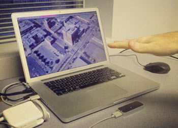
This is an idea though that is actually already being realised thanks to the ‘Leap Motion’ – a small infrared controller that allows users to use their fingers as mouse cursors and a range of gestures as controls. Using the Leap you can point at the link you want to launch and have it trigger, or you can swipe your hand left to move onwards. And in some ways the Leap Motion is actually more advanced than the Minority Report computer – unlike Tom Cruise people using the Leap don’t need to wear a glove…
Unfortunately the Leap Motion hasn’t quite caught on the way it could have thanks to some problems with the technology that lead to it being a little too temperamental. Furthermore, the reality of ‘touchless’ computer has turned out to be a little less practical than you may have imagined. Apart from anything else, touchless computing is both less accurate and more tiring when compared to using a mouse or a touchscreen. Use a mouse is still by far the quickest way to move drag and drop an icon.
This might also be why there’s no incredible browser built to work with Microsoft’s Kinect yet too, though what we are seeing is pretty impressive implementation of the voice control feature for navigation.
What this tells us
 Whether the Leap Motion takes off though, or touchscreens continue to develop, what’s clear is that the future of web design is intuitive. If you want your site to feel high tech and to stay relevant, then using gestures for turning the page and large buttons for launching hyperlinks is going to be the way forward.
What’s important to remember as a web designer is that Minority Report is ultimately a film. It had some good ideas that turned out to be useful, but primarily the scenes involving its interface were all about entertaining the audience. When technology is at its very best it actually seems to disappear. Great futuristic web design should be so intuitive that everyone knows how to use it as soon as looking at it – even if they can’t use a computer. Web design that you want to reach out and touch is the future, regardless of the hardware that powers it.
Image sources:
flickr.com/photos/8566600@N07/4087425590
flickr.com/photos/41894167721@N01/9504771843
flickr.com/photos/32659528@N00/2348628910
Author: Kristina Parker
Kristina Parker is a freelance blogger who often writes for 7strategy, a leading website designer company. In her spare time, Kristina loves playing tennis or going to the beach with her friends.
Twitter •