 User experience has never been more important than it is now – with companies now realizing that many of their customer base not only browse the internet daily – but also operate online, order online and socialize online too.
Good user experience is the one thing that can really set you apart from your competition. It’s about making your user’s journey through your website pleasurable, easy, simple and most importantly – efficient. Bad user experience is often due to lack of good design, faulty servers or bad copy and content – which obviously leads to many mistakes, should you muck up in any of these areas.
How Does Parallax Scrolling Enter the Equation?
Well Parallax scrolling is a new trend hitting the web design world and one which has gone down really well online, both with users and developers. It makes your website much more visually intriguing, memorable and unique – but it also highly improves your user’s experience on the site too. Something that can lead to more sales, more referrals – and inevitably – more profit.
According to Wikipedia, “Parallax scrolling is a special scrolling technique in computer graphics, wherein background images move by the camera slower than foreground images, creating an illusion of depth”
Parallax scrolling is fantastic to embrace for your website, not just because it makes navigation simple (and navigation is a key component of user experience online) but also because it injects a little personality and fun into your website – perfect for brands who want those kinds of traits to be emphasised. What could otherwise be seen as dull web design – adding something as simple as Parallax scrolling – can suddenly make the page come alive, meaning your brand is now interacting with your user – but just passively sharing information. It’s creativity with maximum output too, because it puts you one step ahead of competitors who might be lacking flair design-wise.
But you don’t have to be a creative website or a youthful brand to embrace parallax scrolling – in fact, it could even work to your advantage if your content, subject matter or industry is relatively dry (such as insurance or banking). Whereas with traditional design, people may be reluctant to explore your content and read it – adding an interesting structure such as parallax scrolling – could add enough intrigue to keep them on the site longer – and keep them engaged with the content.
Here are some examples of brands who are doing it right:
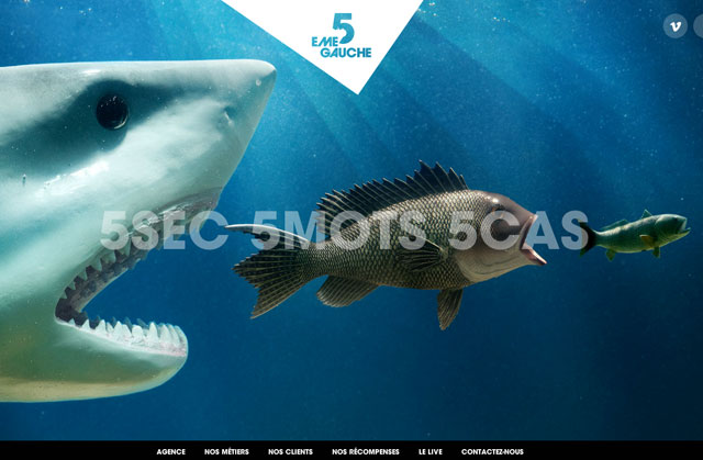
1. 5emegauche (www.5emegauche.com)

These guys have used bright colours and vivid imagery to support the scrolling mechanism – but overall it’s powerful and successful too. The scrolling actually differs with each page you enter – meaning as a user you have to play around with the site and it’s function to figure it out. Whilst this isn’t everyone’s cup of tea – t’s definitely something to grab your attention.
2. Atlantis World’s Fair (lostworldsfairs.com/atlantis)
I think the sheer creativity in this one needs some kind of recognition – as it’s perfect visually and keeps you tuned into the site for longer than I averagely would. I like their take on parallax scrolling because they’re not just using it to portray information – but they’re using it to tell their story too – in an incredibly visual way.
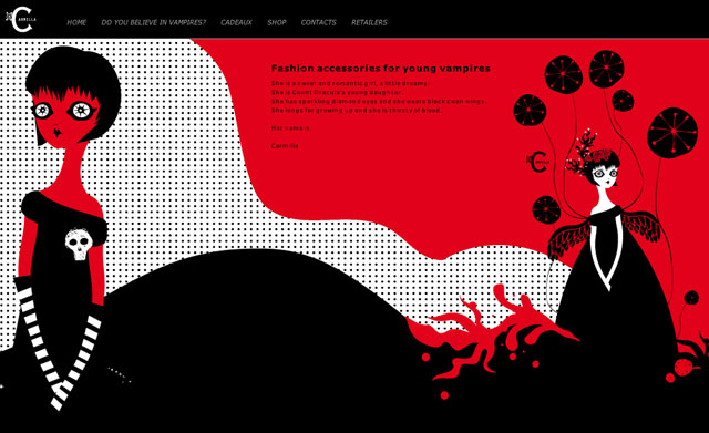
3. Carmilla Vampire Store (www.rossocarmilla.com)

This quirky brand needs an equally quirky website to go with it – and the way she’s used horizontal scrolling really works a treat. It’s smooth and fluid and keeps the brand and imagery strong all the way to the finish.
4. OK Studios (www.ok-studios.de)

These guys have used the scrolling slightly differently to offer on the list – but they gained recognition for it because of the variation and the uniqueness that they’ve come up with. A quick play around with their site will quickly show you how they’ve succeeded with it too, and how amazingly designed and coordinated all their images are. Definitely one of my favourites on this list.
Author: John Miller
John oftentimes takes the lead as the Agile Project Manager and SEO expert, which allows him to be hands-on with the latest trends.