Conversion optimization is a little bit like flossing your teeth: everyone agrees it’s an important thing to do but very few people follow through and take the time and effort needed to make it happen. That’s too bad because having a poor-converting website is akin to leaving money on the table. You can have an SEO-superpowered site with social media traffic by the boatload, but if they don’t convert those visitors might as well not have visited at all.
Fortunately, you don’t need fancy split testing software or the help of a conversion optimization expert to get you more clicks, customers and subscribers. Here are 4 real case studies that demonstrate straightforward and simple ways to increase your conversions in a flash.
I. SocialTriggers.com: Give them a chance! Actually, 2 or 4
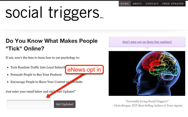
Derek Halpurn of SocialTriggers.com has a funky looking homepage that converts like gangbusters. Besides being a simple page with a strong call to action, Derek also gives his visitors more than 1 chance to convert. Here is his homepage:

He has 1 field for his opt-in form and 2 links to a squeeze page for his newsletter. He also has another opt-in field right below the fold in his sidebar. With banner blindness stronger than ever, you really do need to push the envelope with your landing pages and force people to make that conversion.
II. Dustin Curtis: Ask directly

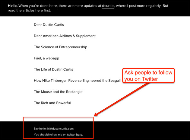
Dustin Curtis (www.dustincurtis.com) had a problem. Even though he got massive amounts of traffic to his site, he wasn’t converting them into Twitter followers. That is, until he changed the easily-ignored “I’m on Twitter” (who isn’t?) to “You should follow me on Twitter here”. In fact, his conversion rate increased a whopping 173% from this change alone. What language can you use to get people to convert without coming on too strong?
III. SurveySpencer.com: Make a list
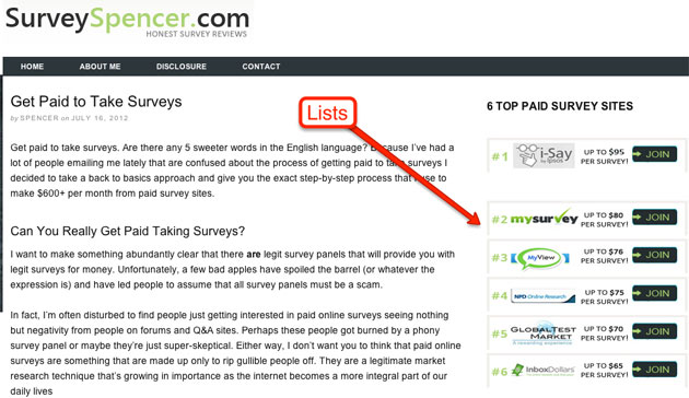
If you ever pass by the magazine rack at a newsstand you’ll notice one thing that almost all headlines have in common: numbered lists! There’s just something about humans that draw us to rankings, list and top 1o-lists. A few weeks one of my mini sites, SurveySpencer.com was struggling with conversions on my survey reviews – which didn’t have the strong call to action of the homepage. However, I recently added a numbered list to my sidebar with the heading “6 Top Paid Survey Sites” and my CTR went from about 11% to 19% almost instantly. You can see an example of that here:

IV. CityCliq.com: Make your USP clear

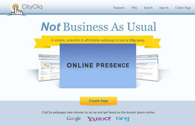
Your USP (unique selling proposition) is what separates you from your competitors. Instead of trying to come up with a clever headline that no one cares about, why not just tell your visitors why you exit in plain English (what a concept!). As reported at ABTests.com, CityCliq.com increased their conversions a whopping 89% just from changing their headline from the obtuse “Businesses Grow Faster Online” to “Create a Webpage for Your Business”. Considering that your traffic is pressed for time, try to give them a crystal clear pitch as fast as possible.
Have these tips been helpful? How do you increase your conversion rate? Please share your comments below.