 Let’s admit it: you’ve fantasized about getting a 10+% conversion rate and what that would do to your business.
With higher conversion rates, a business can afford to spend more on advertising, bring in more traffic and usually generate more profit.
However, if you’ve actually tried to increase your conversion rate, you’d know that it’s not an easy task and it requires to:
- Understand how different digital marketing technologies (eg. SEO, SEM, usability, etc) work – which, in my opinion, is an easy part. You just have to buckle up to your computer chair and learn the craft by reading hundreds of blog posts and conducting own SEO experiments.
- Understand how human behaviour perceives the web, and this is a very difficult task to do. There are no “step-by-step” guides to know what customers really think about when they browse web pages. Online marketers who master the art of online human behaviour can be proudly referenced as the industry leaders.
Here are 5 psychological tips on how to increase your website conversion rate:
1. Use of color
Psychological studies have shown that color is one of the first things your mind registers when you look at something. It’s one of the reasons behind the Stroop Effect. Color, as you may already know, affects what we think about the site that we visit.
Let’s talk about how to use color to guide action online. The part of your brain that processes color is largely subconscious and therefore prone to subtle cues. While red color, for example, associates with passion in the offline world, in the online marketing, red color generally indicates “stop” or “danger” and green color indicates “go” or “safe”.
Designers who understand color psychology can design better converting pages than those artists who do not pay attention to the importance of this topic.
Here’s an example. Most designers I’ve worked with prefer the site to look good by sticking to a theme. “Does it match?” is their primary question. But if everything “matches”, nothing stands out.
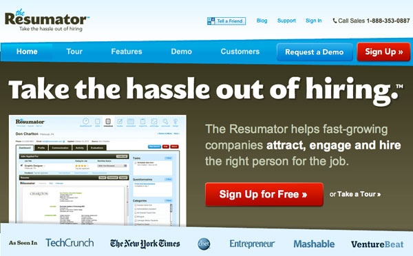
Try this instead: intentionally use a color that stands out for your call-to-action buttons. It will immediately get more attention, which will lead to more clicks, and therefore more conversions. Read this blog post by Josh Porter titled The Button Color A/B Test: Red beats Green.
Here is an example of how Resumator uses a red sign up button to make it stand out:

2. Use social proof
Taking an action, whether you consciously realize it or not, is a risky business. What if this is a scam? What if I’m signing up to a spam list? What if I catch a virus if I click on that button?
Social proof, the fact that thousands of other users “liked”, helps to ease those worries. After all, if someone’s popular, they must be good, right?
It has never been easier than nowadays to get and implement a social proof on your landing pages. In fact, I’m sure you already have a social following. Yet, we rarely see businesses proudly display their follower counts on the landing pages. Below Hulihealth uses their 2.4k fans as social proof for you to take action:

3. Determine personality of your target audience
The question here is whether or not your website resonates with your target audience.
Lots of marketing “gurus” out there preach that your site should have a “laid back” tone, it should be “personal” and overall, “warm and fuzzy”. But is that really true?
What if your website’s main audience consists of the high-powered Wall Street bankers?
My contention is that as long as your site resonates with your audience, you’re good to go. So ask yourself a question, “|who is my audience?” Then develop a persona, a fictional character based on your target customer, and design for that character.
Here are a few things that will affect the personality of your site:
- the tone of your content (serious or fun)
- the images (illustrations or stock photos)
- the design (retro or modern)
- your vocabulary
The screenshots below show two different parts of the same site that cater to different personalities:

4. Make it easy for users
There was a government study conducted a few years ago to see what makes people donate their organs when they pass away. Donating organs, of course, is a serious matter, and the researchers expected an uphill battle.
The statisticians took a number of approaches, one of which was the mass advertising and education campaign focused on the importance of organ donations.
Eventually, they saw only a small uptick.
Then a clever government official made a small change to the strategy and this change more than DOUBLED the number of organ donors. This change did not involve paying the money to donors’ families. Guess what did he do?
He made the option to opt-in to be the default instead of opt-out. If people want to keep their organs after they pass away, they’ll have to fill out a few forms. Now you’d think that because organ donations are so important, everyone would fill out the forms to keep them… but that was not the case.
That’s the power of making things easy to do.
Making your online forms as short as possible. If you really need all that information from your user, break the forms into 2 to 3 steps, so that they appear less intimidating than if they were all on one page. Ask yourself if you can get users to sign up with minimum information before getting the users to fill out all of the optional fields.
Lastly here’s a handy tip: tell your users how long the online registration will take (eg: it only takes 10 seconds to sign up!). By communicating how easy the process is, you make it more inviting for people to go through it.
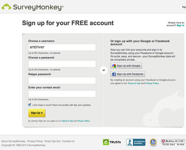
Here is how Survey Monkey chose to keep their sign up form short (with the checkbox pre-ticked by default) and allow users to use their Google and Facebook details to automatically sign up without filling out the form:

5. Empathize with your audience
You need to empathize with your customers. What does empathy mean? Well, it’s more than just putting yourself in your customer’s shoes.
We define empathy as the ability to feel and describe (using customers’ lingo) what your customers feel about their problems or challenges.
It is crucial to write and speak the language of your customer, because it allows you to clearly communicate to the customer the solution to his/her concerns. For people to actually believe in something, you need to research what customers feel about a problem and use relevant words in your copy to propose a solution to that problem.
Here is how Socrato promises “higher scores” instead of “higher marks” or “higher grades,” because they know that students and teachers use that specific term:

Which button would you click here? Please share your thoughts in the comments area.

Andrianes Pinantoan is part of the team behind Open Colleges, a TAFE Courses provider with a great web design course. Andrianes can also be found on Google+.
Author: John Miller
John oftentimes takes the lead as the Agile Project Manager and SEO expert, which allows him to be hands-on with the latest trends.